My Role Known for its cloud-based name pronunciation tool, NameCoach wanted to refresh the look of their website and rethink how they position themselves in the digital space. My role was to help reimagine what the brand could look like and how to better appeal to their target audience by defining a narrative surrounding inclusion and accessibility.
About NameCoach
NameCoach is an online tool that allows users to easily record and listen to the correct pronunciation of names. It is designed to help institutions and businesses promote inclusiveness by ensuring that people's names are pronounced correctly.
Understanding the problem space
As a tool that promotes inclusion, making the website visually appealing and accessible on all devices was crucial. We identified significant problems with the old version of the website:
The website was not responsive, lacking consistency across different devices.
Poor information architecture with no organizational principle for individual items.
Lack of design consistency across different pages within the website.
NameCoach's website is the first place where users can sign up to start using the name pronunciation tool.
We aimed to improve two key business metrics through the website redesign:
Reduce bounce rate: We observed that many users who accessed the website left without interacting with the page or visiting any other pages.
Increase conversion rates: We wanted to encourage more users to sign up on the website and start using the name pronunciation tool.
Creating a responsive website
The old version of the website was not optimized for viewing on different devices with various screen sizes. This led to broken components and images that would shrink.
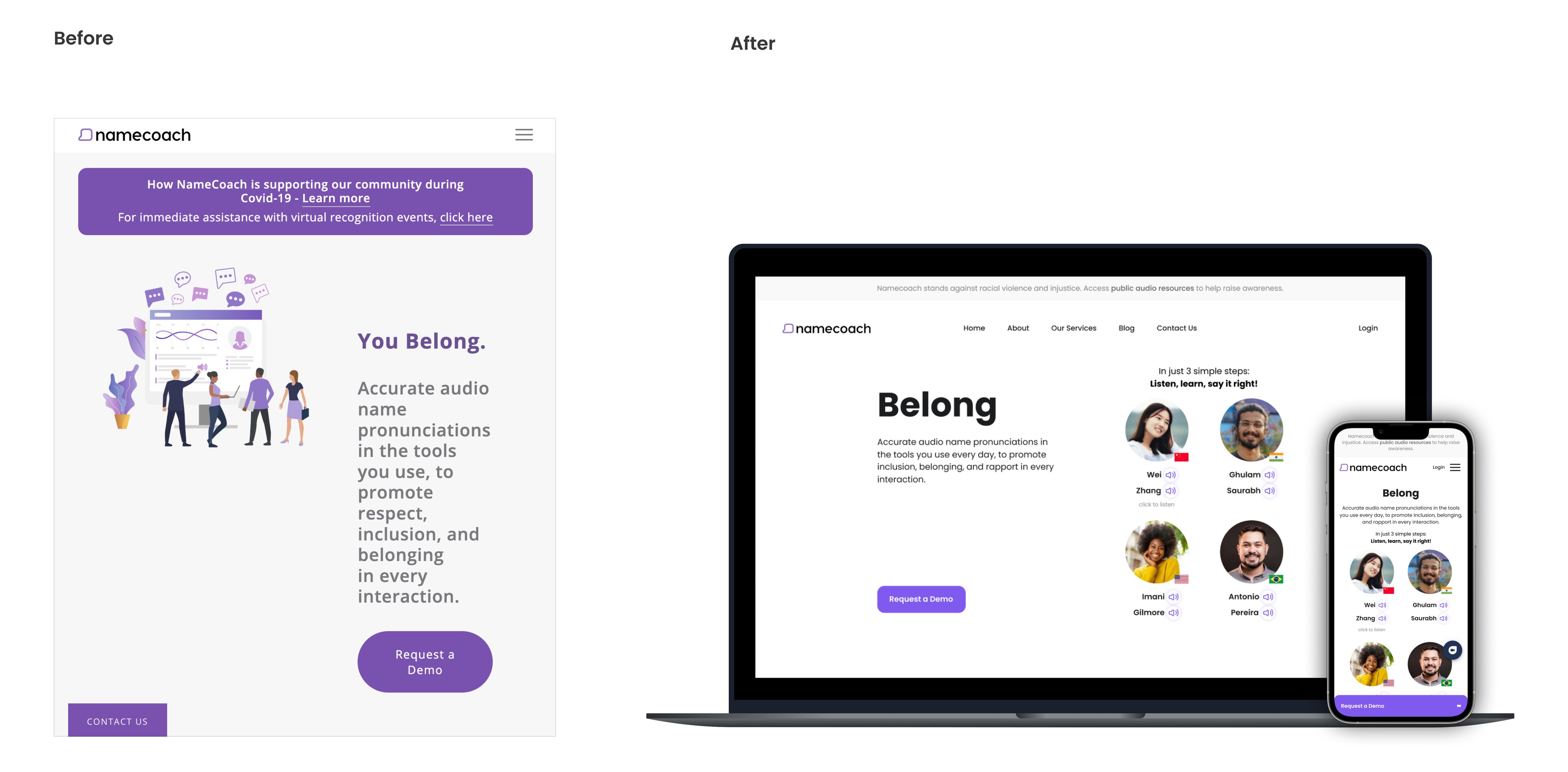
Our primary goal for the redesign was to ensure the new website would be responsive and consistent across various devices.
Improving the information architecture
Another essential aspect of the redesign was to improve the information architecture, ensuring that all content was well-structured and organized.
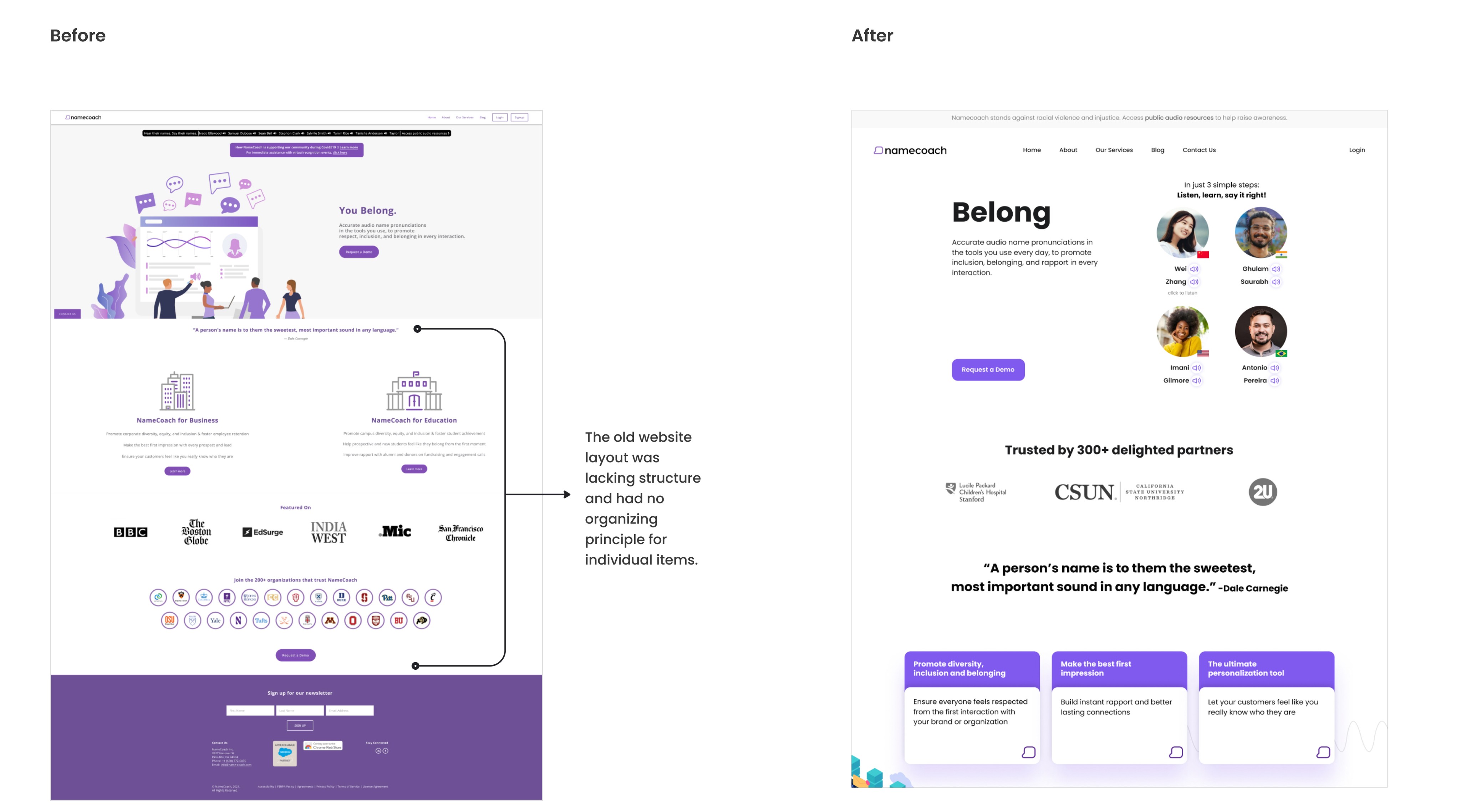
Through content organization and information architecture concepts, we achieved visual consistency while staying true to the existing branding.
Creating consistency
During our analysis of the entire website, we noticed inconsistent design elements across components. Different pages were utilizing various footer layouts, buttons, and colors.
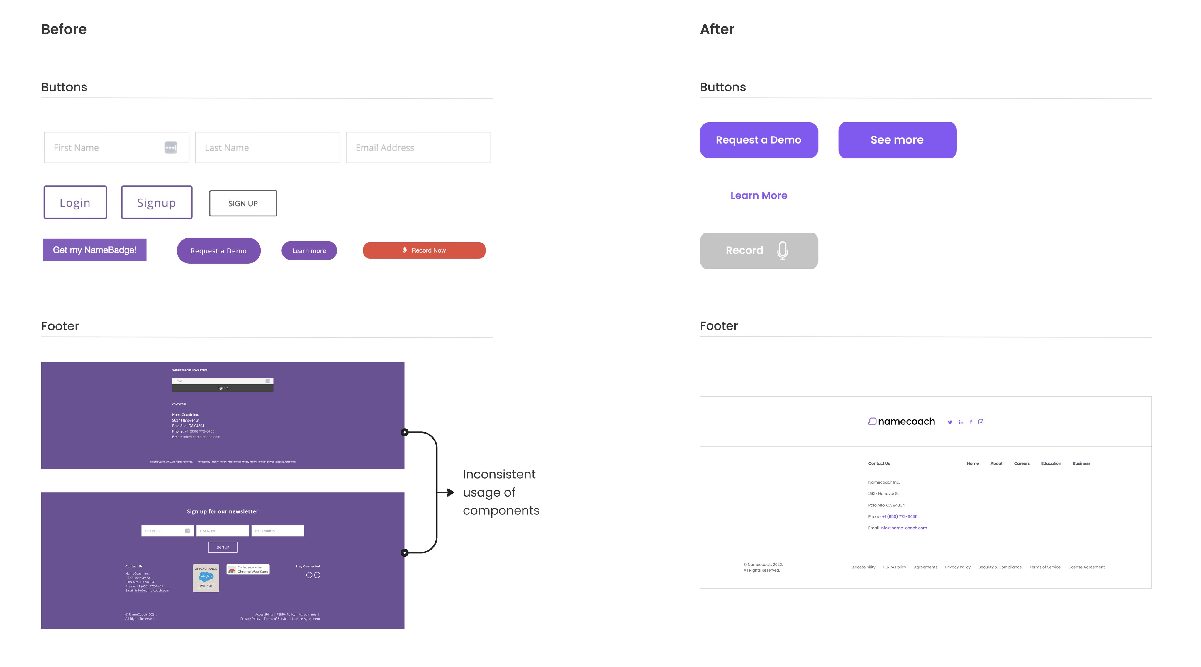
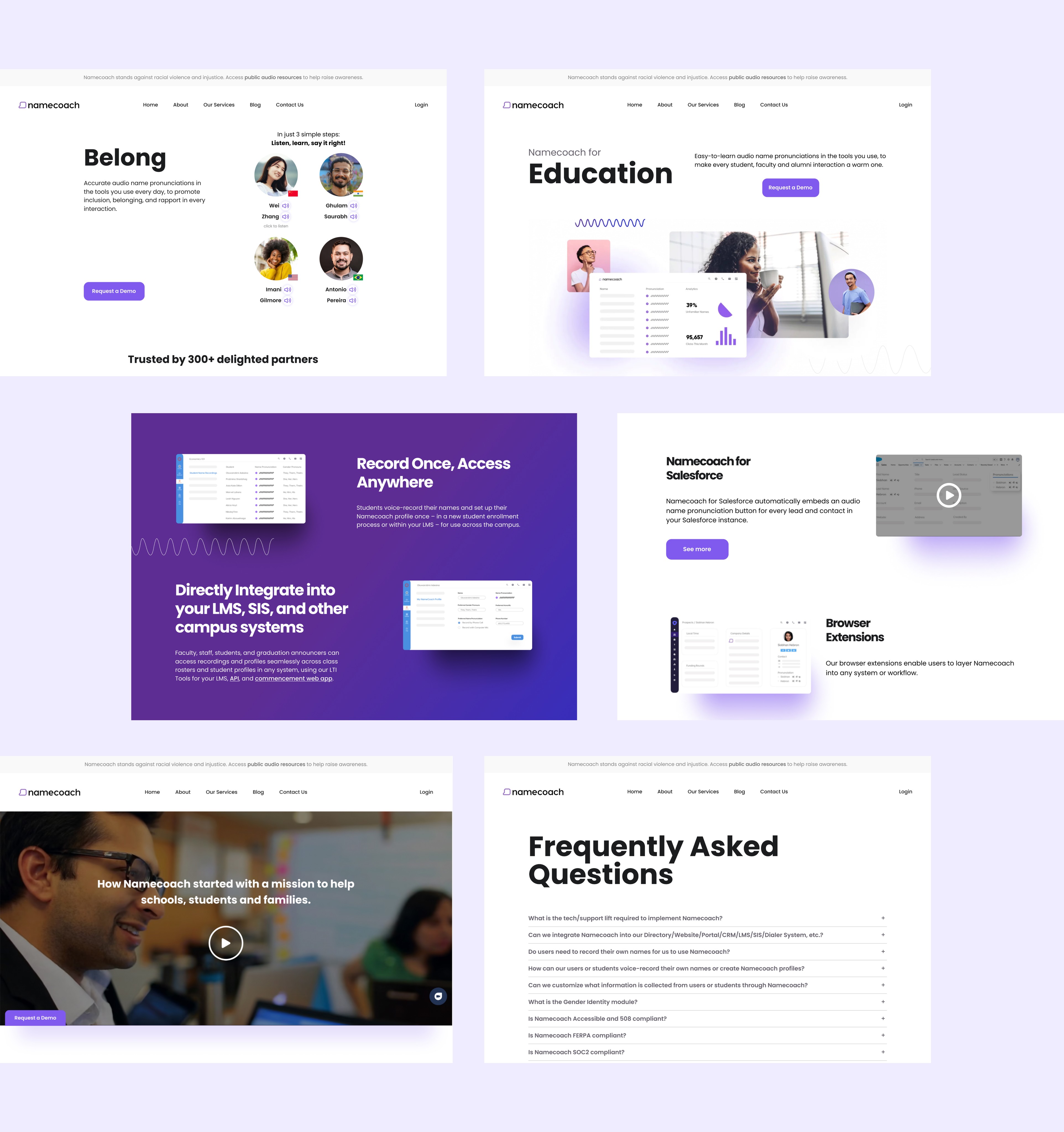
We strategically introduced new visual elements throughout the website to achieve a sense of consistency.
Final Design
NameCoach believes that inclusion should be promoted within both business and educational institutions. By focusing on the brand’s core values, I helped craft a narrative around what makes their name pronunciation tool unique.
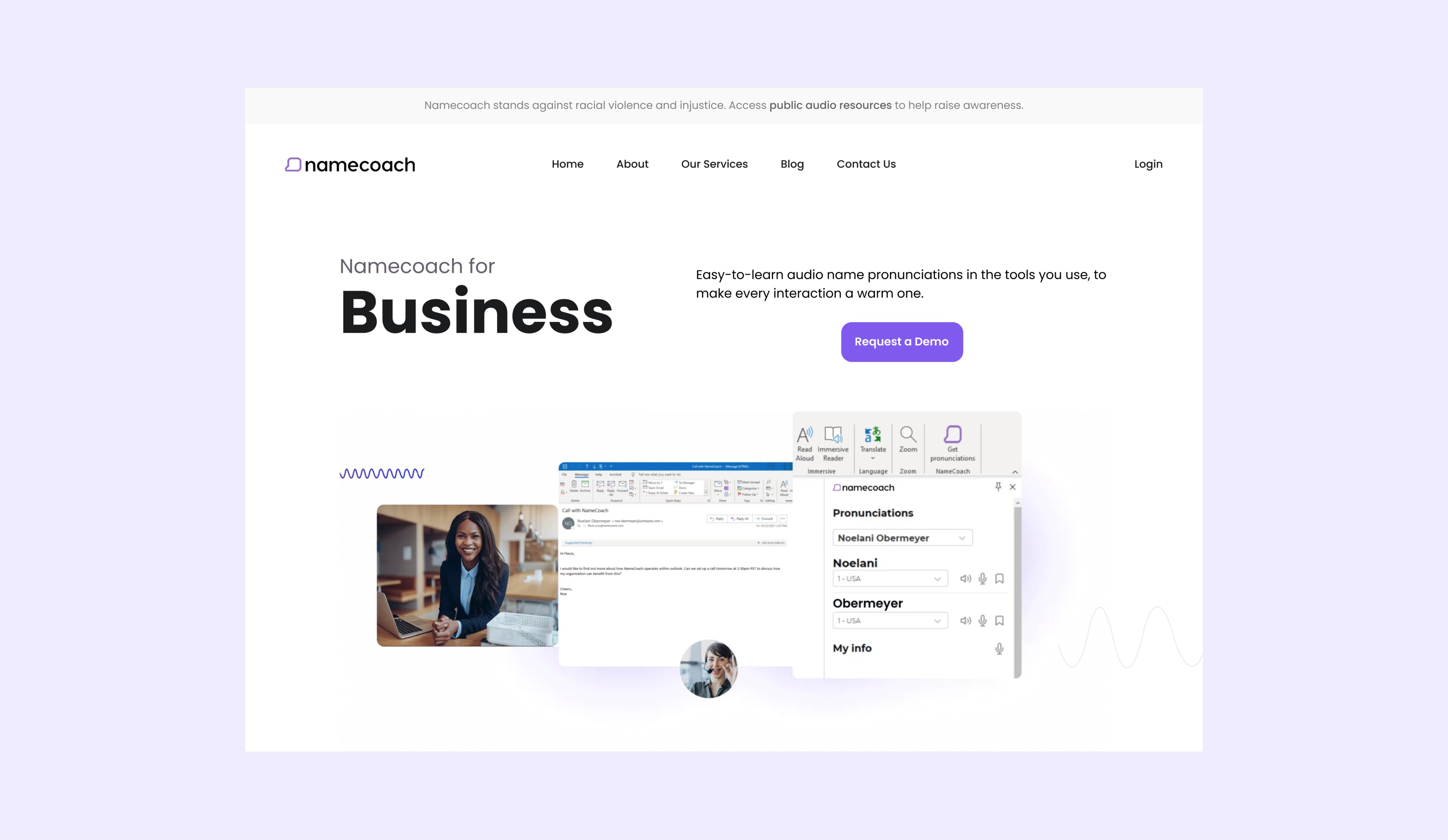
Delivering more value to the user
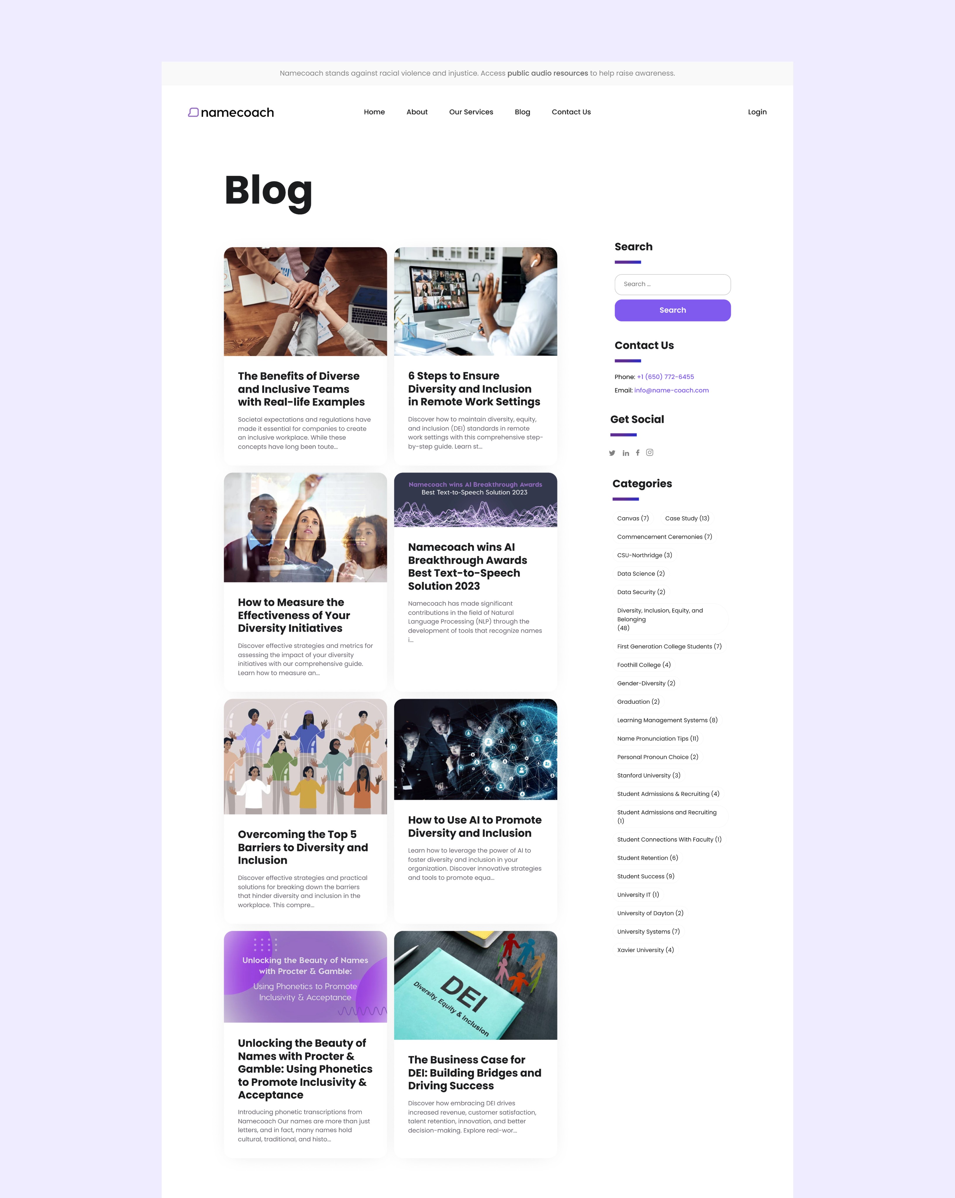
To enhance the experience, we have added a blog and news page to the website, providing users with relevant content.


Impacts
The website redesign had a positive impact on the user experience, leading to successful improvements in its metrics:
The bounce rate decreased by 37%, indicating that users not only accessed the website but also engaged with the content and explored other pages.
Reflections
During this project, I learned the importance of maintaining both functionality and design consistency. I recognized how these aspects harmonize to shape user experiences, ensuring that the product operates seamlessly while presenting a user-friendly interface.
If you're curious to see what the new website looks like, you can check it out here.
Next project
